
You Might Not Need a Custom Block: The Block Styles API
When you’re building a WordPress site, getting your blocks to look just right can be a bit of a challenge. Whether it’s buttons, headers, or other elements, you might find yourself adding custom CSS or even creating new blocks just to match your design. But there’s a simpler way—using the Block Styles API.
The Block Styles API lets you extend existing blocks by adding custom styles or variations. Instead of creating a new block from scratch, you can use this API to register new styles that can be easily applied in the block editor. This means you can keep your design consistent across your site without the extra hassle.
As I always say, check the documentation if you want to learn more about how the Block Styles API works. You can find the official guide and a detailed example that will give you more insights. In this post, I’ll show you how to put it into practice with two real-world examples: custom button styles and different header styles.
Creating a Set of Button Styles
Custom button styles are a great way to maintain design consistency across your WordPress site. Instead of relying on default button styles or adding custom CSS every time, you can create specific styles that match your site’s branding and design needs. In this example, we’ll create a plugin that adds a couple of button styles to the TT4 theme, including primary, and secondary buttons. These styles will be easy to apply directly from the block editor.
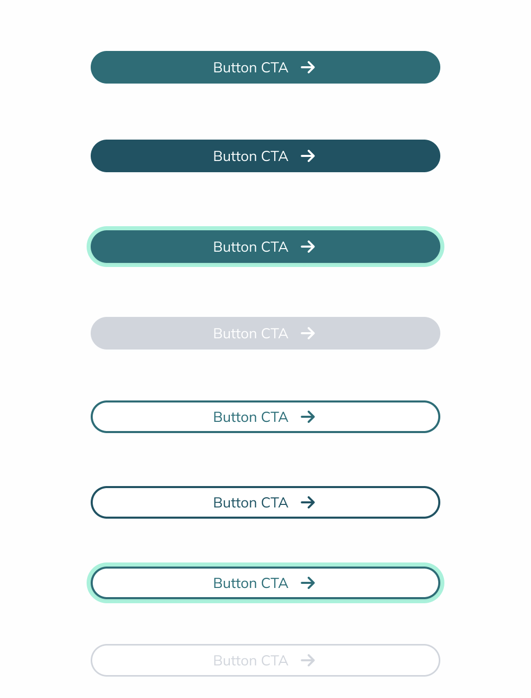
To implement these custom button styles, we’ll use the wp.blocks.registerBlockStyle function. This allows us to register new styles for the button block, making them selectable in the editor.
Here’s how you can do it:
Create the Plugin: First, create a new plugin folder and file, e.g., custom-block-styles.php.
Register the Plugin and Button Styles
<?php
/*
Plugin Name: Custom Block Styles
Description: Adds custom block styles to the TT4 theme.
Version: 1.0
Author: ElPuas
*/

// Define the namespace to avoid function name conflicts
namespace elpuas;

// Security check to prevent direct access to the file
if ( ! defined( 'ABSPATH' ) ) {
    exit; // Exit if accessed directly
}

function custom_block_styles() {
    // This is where we’ll add our custom block styles
}

// Hook our function into the 'init' action
add_action('init', __NAMESPACE__ . '\custom_block_styles');
Registering Custom Block Styles (Server-Side)
In this example, we’re using the server-side registration method for our custom block styles. This approach allows us to define the styles on the server, making it easier to manage and more efficient, especially for more complex styling needs.
To register a block style server-side, we use the register_block_style() function. Here’s how we can register a custom button style:
register_block_style(
        'core/button',
        [
            'name'         => 'custom-primary-button',
            'label'        => __( 'Custom Primary', 'elpuas' ),
            'inline_style' => '
                .wp-block-button:is(.is-style-custom-primary-button) {
                    .wp-block-button__link {
                        background-color: #026E78;
                        color: #ffffff;
                        border-radius: 9999px;
                        padding: 10px 120px;

                        &:hover {
                            background-color: #015364;
                        }

                        &:focus,
                        &:focus-within {
                            outline: solid 2px #94F3DA;
                        }
                    }
                }
            ',
        ]
    );
Key Parameters:
Block Name ('core/button'):This parameter specifies the block to which you’re adding the style. In our case, we’re targeting the core button block, so we use 'core/button'.You can apply this to any registered block, whether it’s a core block or a custom one.
Name ('custom-primary-button'):This is a unique identifier for your custom style. It will be used in the CSS class that WordPress applies to the block when this style is selected.The 'name' should be unique among the styles registered for this block.
Label (__( 'Custom Primary Button', 'textdomain' )):The 'label' is what will appear in the block editor for users to select. It’s the human-readable name of your style.We use the __( 'Primary Button', 'textdomain' ) function for localization, making sure the label can be translated into other languages if needed.
Inline Style ('.wp-block-button.is-style-custom-primary-button { ... }'):The 'inline_style' parameter allows you to define the CSS that will be applied when the style is selected. This is a quick and direct way to style your block.The CSS is scoped to this specific block and style using the .wp-block-button.is-style-primary-button selector, ensuring the styles only apply when this style is selected.
These are the key parameters we’re using in our example. There are additional parameters like 'style_handle' and 'editor_style' that you can use for more advanced scenarios. For a complete list of options and more detailed explanations, I recommend checking out the WordPress documentation on block styles.
Now that we’ve set up our custom block style using the server-side function, it’s time to put it to the test. Here’s the complete function with our first custom button style:
<?php
/*
Plugin Name: Custom Block Styles
Description: Adds custom block styles to the TT4 theme.
Version: 1.0
Author: ElPuas
*/

namespace elpuas;

if ( ! defined( 'ABSPATH' ) ) {
    exit;
}

function custom_block_styles() {
    register_block_style(
        'core/button',
        [
            'name'         => 'custom-primary-button',
            'label'        => __( 'Custom Primary', 'elpuas' ),
            'inline_style' => '
                .wp-block-button:is(.is-style-custom-primary-button) {
                    .wp-block-button__link {
                        background-color: #026E78;
                        color: #ffffff;
                        border-radius: 9999px;
                        padding: 10px 120px;

                        &:hover {
                            background-color: #015364;
                        }

                        &:focus,
                        &:focus-within {
                            outline: solid 2px #94F3DA;
                        }
                    }
                }
            ',
        ]
    );
}

add_action('init', __NAMESPACE__ . '\custom_block_styles');
Now, let’s put our first custom button style to the test. After activating your plugin, simply create a new page, add a Button block, and select the “Primary Button” style from the block settings. Once applied, you’ll see your custom button style come to life both in the editor and on the front end.
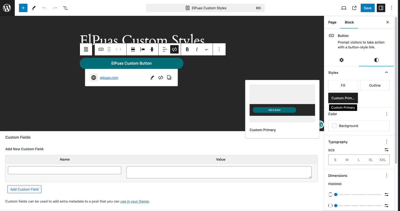
Oops, I almost forgot! To make our button style even more engaging, let’s add an icon and a nice hover animation. We can use this updated style as a starting point for our other button styles.
For the icon, we’ll use an SVG encoded in Base64, which is a neat way to include it directly in our CSS.
Here’s the updated inline_style:
'inline_style' => '
    .wp-block-button:is(.is-style-custom-primary-button) {
        .wp-block-button__link {
            background-color: #026E78;
            color: #ffffff;
            border-radius: 9999px;
            padding: 10px 120px;
            display: flex;
            align-items: center;
            justify-content: center;

            &::after {
                content: url("data:image/svg+xml;base64,PHN2ZyB3aWR0aD0iMjAiIGhlaWdodD0iMjAiIHZpZXdCb3g9IjAgMCAyMCAyMCIgZmlsbD0ibm9uZSIgeG1sbnM9Imh0dHA6Ly93d3cudzMub3JnLzIwMDAvc3ZnIj4KPGcgY2xpcC1wYXRoPSJ1cmwoI2NsaXAwXzk2NzBfMzY2MSkiPgo8cGF0aCBkPSJNNC4xNjY3NSAxMEgxNS44MzM0IiBzdHJva2U9IndoaXRlIiBzdHJva2Utd2lkdGg9IjIiIHN0cm9rZS1saW5lY2FwPSJyb3VuZCIgc3Ryb2tlLWxpbmVqb2luPSJyb3VuZCIvPgo8cGF0aCBkPSJNMTAuODMzMyAxNUwxNS44MzMzIDEwIiBzdHJva2U9IndoaXRlIiBzdHJva2Utd2lkdGg9IjIiIHN0cm9rZS1saW5lY2FwPSJyb3VuZCIgc3Ryb2tlLWxpbmVqb2luPSJyb3VuZCIvPgo8cGF0aCBkPSJNMTAuODMzMyA1TDE1LjgzMzMgMTAiIHN0cm9rZT0id2hpdGUiIHN0cm9rZS13aWR0aD0iMiIgc3Ryb2tlLWxpbmVjYXA9InJvdW5kIiBzdHJva2UtbGluZWpvaW49InJvdW5kIi8+CjwvZz4KPGRlZnM+CjxjbGlwUGF0aCBpZD0iY2xpcDBfOTY3MF8zNjYxIj4KPHJlY3Qgd2lkdGg9IjIwIiBoZWlnaHQ9IjIwIiBmaWxsPSJ3aGl0ZSIvPgo8L2NsaXBQYXRoPgo8L2RlZnM+Cjwvc3ZnPgo=");
                height: 20px;
                margin-left: 10px;
                transition: transform 0.3s ease;
            }

            &:hover {
                background-color: #015364;

                &::after {
                    transform: translateX(5px);
                }
            }

            &:focus,
            &:focus-within {
                outline: solid 2px #94F3DA;
            }
        }
    }
',
Creating Another Button Style
Since creating a new button style follows the same process as the first one, you can easily add another style by changing the name, label, and inline_style parameters.
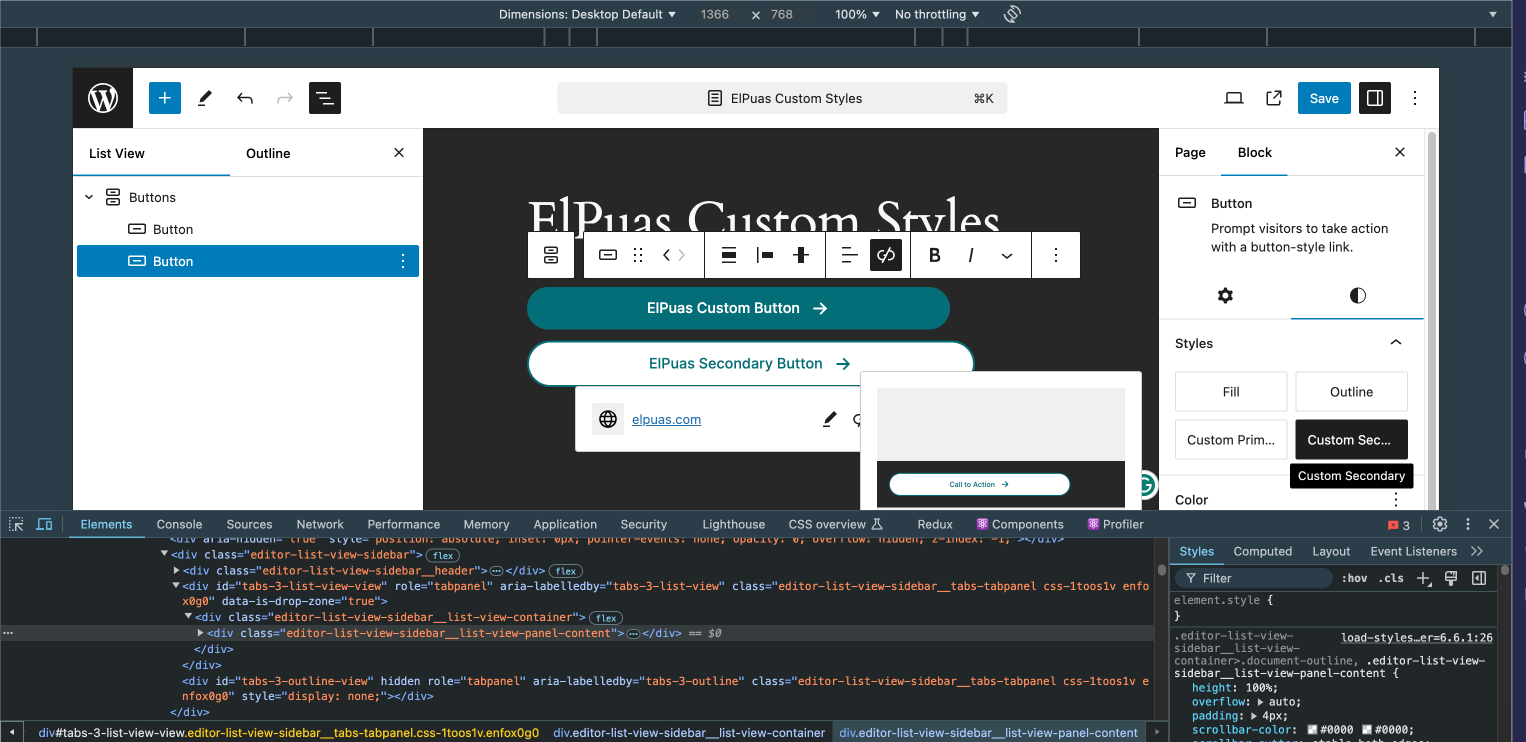
For example, to create a Secondary Button, just modify the name and label to something like custom-secondary-button and Custom Secondary. Then, adjust the inline_style to match your desired design, such as changing the background color, icon, and hover effects.
register_block_style(
    'core/button',
    array(
        'name'         => 'custom-secondary-button',
        'label'        => __( 'Custom Secondary', 'elpuas' ),
        'inline_style' => '
            .wp-block-button:is(.is-style-custom-secondary-button) {
                /* Your custom styles here */
            }
        ',
    )
);
After implementing this code, your secondary button style will be available in the block editor, and you’ll be able to apply it just like the primary button.
Creating Custom Header Block Styles
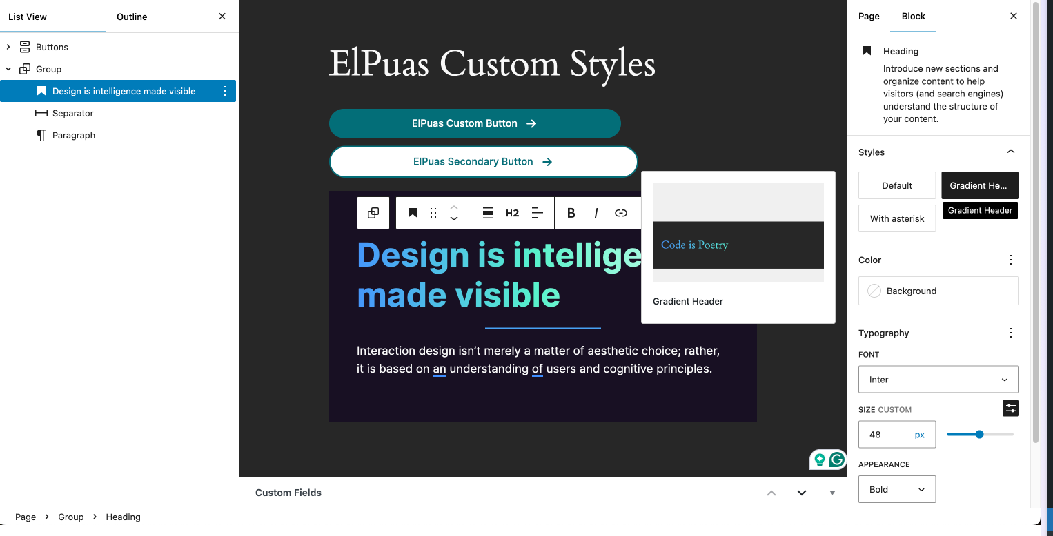
Now let’s move on to customizing the Heading Block. We’ll create a distinct header block style: a Gradient Header.
Customizing headers with unique styles like gradients and glowing effects can make your content more visually appealing and engaging. We’ll add these styles to the Heading Block so they can be easily applied in the block editor.
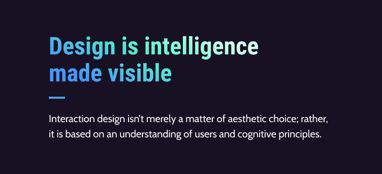
Just like with the button styles, we’ll use the register_block_style() function to register our new header styles. Let’s start with the Gradient Header.
register_block_style(
    'core/heading',
    array(
        'name'         => 'gradient-header',
        'label'        => __( 'Gradient Header', 'elpuas' ),
        'inline_style' => '
            .wp-block-heading.is-style-gradient-header {
                background-image: linear-gradient(to right, rgba(69,150,251,1) 0%, rgba(87,242,204,1) 48%, rgba(212,255,236,1) 100%);
                color: transparent;
                background-clip: text;
                -webkit-background-clip: text;
            }
        ',
    )
);
Now, add this function to your plugin. You can use the same function where your other styles are registered. With this style applied, your heading should look like the example, adding a bold and creative touch to your content.
Conclusion
You don’t always need to create custom blocks from scratch to get the design you want. The Block Styles API makes it easy to add unique styles to existing blocks, like the custom buttons and headers we created in this post.
We used server-side functions to register these styles, but you can also do it with JavaScript if that fits your project better. You can find the final files at the https://github.com/elpuas/elpuas-custom-block-styles repo.
Now that you’ve seen how easy it is, try experimenting with more styles to make your content stand out even more. If you like this post or know someone who will help, please share. Sharing is caring. Happy coding!
--
The gradient header style was inspired by Text Gradients on Figma. The button gradient style was based on the same design principles.
Give and Share
Enjoyed this article? Share it with your friends and colleagues!


